


Studio Diary for a Solo Show: Part 2
Three weeks have past now since my solo show at China Heights opened, and after catching up on some sleep I thought I’d follow up on my studio diary with some more behind-the-scenes insights and post-show reflection about the work.
The Drawings

The completed Hell Yes piece set the tone for the remaining drawings. I wanted to create works that were highly detailed and utilise the list of words I’d collected that lent themselves to illustrative type treatments. While there were loose connections to spirituality and religion I didn’t want each piece to be too heavily attached to these ideas, but rather let the illustration style be the primary link between the individual pieces. I was also keen to mix up the lettering styles, like contrasting a 70s psych lettering piece (Slow Burn) alongside the art nouveau forms (Hell Yes). The floral elements ended up playing a bigger role in the series than previously expected, but were, again, a linking device between the different type styles. The wreath drawing was something I had work on some months ago and ended up fitting in with the collection.


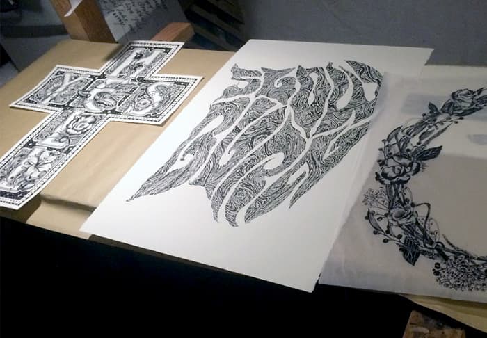


My personal favourite piece from the series was Habit vs Logic, two intricately illustrated swords with the text integrated into the body of the blade. The detailed handles for these were inspired by smaller Spanish letter openers I had picked up in my vintage-store raids earlier in the process. I like the words “Habit” and “Logic” and had originally wanted to paint these on the walls of my studio – the idea was about the battle in one’s thought process between – habit – something that comes naturally and is embedded over time and repetition and – logic – the idea of analysing something more objectively using reason rather than emotion. I like the idea of text being integrated into unique, real objects from another time or place and that these drawings could have been plans for constructing the real thing.
The Noon drawing was based solely on the symmetry of the word – I liked the shapes of this palindrome and wanted to work out a way to link the “O”s together. After playing with different combinations and lettering styles I came across a reference from 15th century illuminated initials that felt like the perfect starting point. When I switched up the layout and stacked the letterforms vertically it fell into place. The dimensionality “N” I drew was a new level of detail for me and at that point I realised this was a style I wanted to carry across into the wall mural.
The Murals


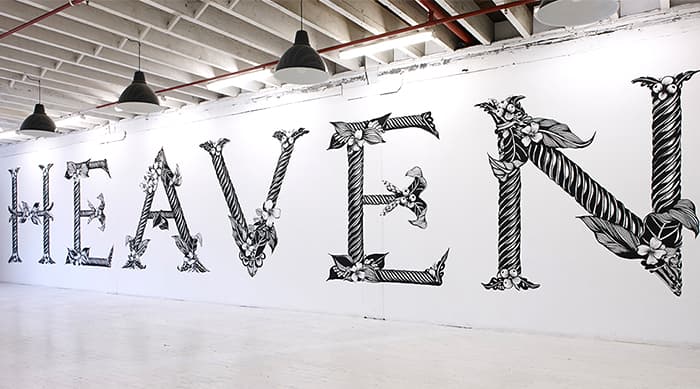

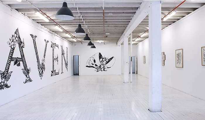
I love working large-scale for murals as the process of painting is quite different to small scale drawing – you get to use your whole body and once the initial setup with the pencils is complete I often find the painting to be quite therapeutic. For this mural I wanted to work in a lettering style that was simultaneously bold and powerful but also gracious and beautiful. Given that the initial letter shapes I drew for the Heaven mural are more traditionally associated with being small illuminated capitals on a printed page, I liked the ideas of scaling these up to large scale to give them a new context. The word Heaven worked for me both on a visual level and a conceptual one. The “A” and “V” had a nice symmetry in the centre of the word and the centre of the wall, and the style of the letterforms was like a decorative interpretation of large scale Roman letters I saw in my travels to Italy last year.
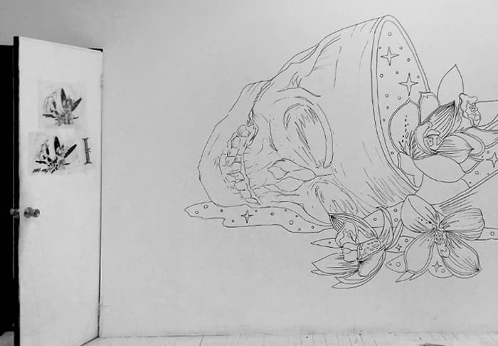
The second mural was a drawing I had worked on in the very early stages of my preparation for the show based on the scientific skull split open and orchids blossoming out of it. I liked the contrast of this piece alongside the pure lettering of the main wall and it also was a key link to the idea of Hiatus – the name of the show and where the idea started. Hiatus means a break or pause in a activity – for me this show was about a pause from more commercial work to explore ideas I’d been wanting to work on for a while and it was great to dedicate a short and intense period in the studio to my these pieces.
The murals were painted over four late nights in the gallery leading up to the opening. I used my usual technique of projecting the image, tracing outlines in pencil over the first evening then using the remaining time to paint fills in black. The Heaven mural was particularly challenging due to the scale. At almost 14 metres long, it took a fair bit of maths, measuring and patience to ensure the letterforms were projected straight and with the correct spacing.


With some help from the guys at China Heights to get the final mural elements painted in time, it was all wrapped up just two hours before the opening at 6pm! The launch night was a great success and it was both daunting and rewarding to share the work I’d laboured over with a big audience. The show continued over the weekend before the walls were repainted white and it was back to the studio for me to start my next projects! Thanks to all that came to the opening and supported the process along the way. There are still some limited edition Hell Yes totes, Hiatus Skull and Slow Burn pins available from the China Heights store.
Gemma
xx
@mrseaves101
@chinaheights
@volcomwomens_oz
